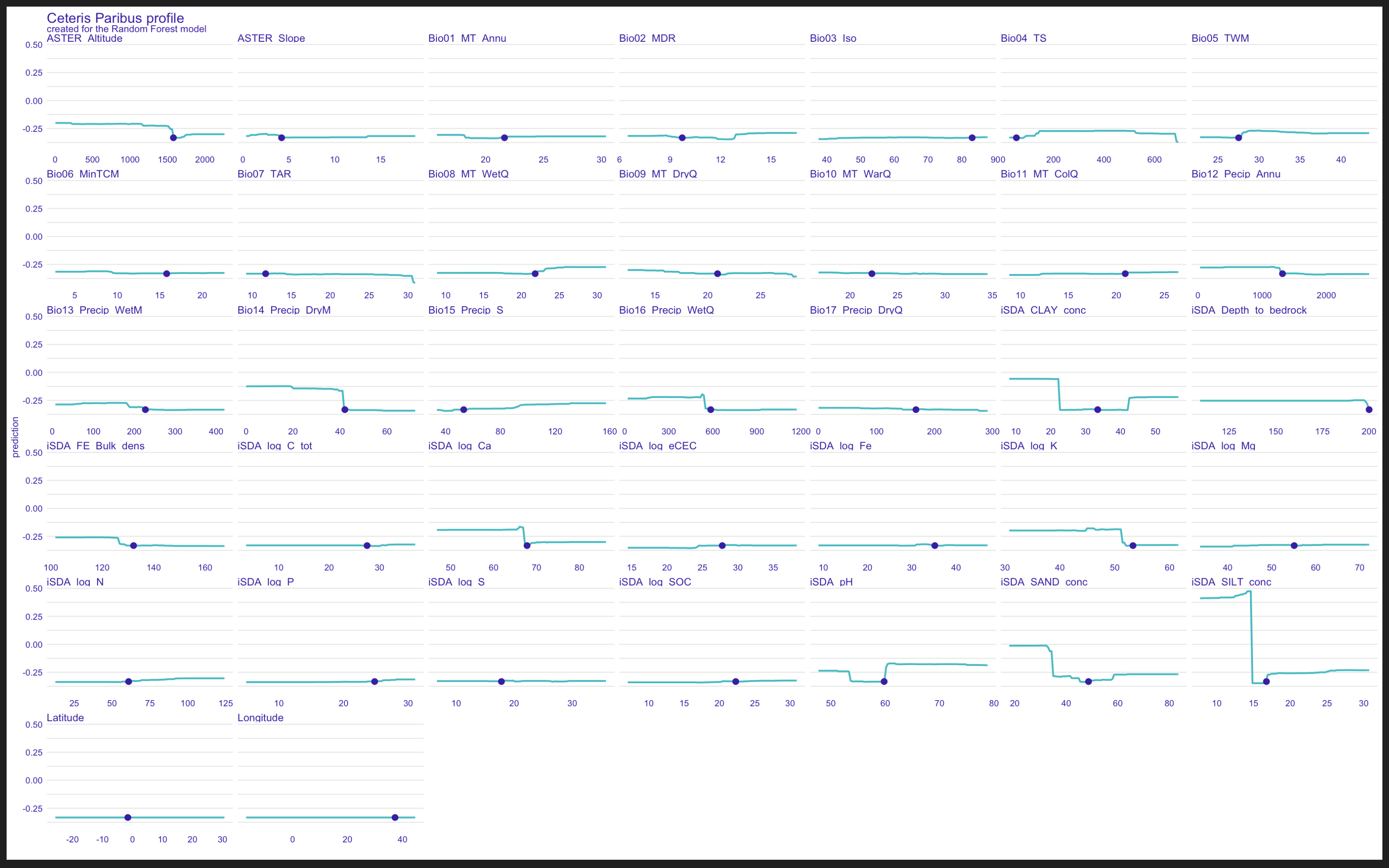
I am using the predict_profile()function and the plot gives a the predicted average on the y-axis while individual variables are faceted and shown on the x-axis. How ever as you see from the screenshot, it is difficult to visually see the defferent relationships between predictors and predict_profile average predictions on the y-axis.
Is it possible to specify "free_y" in predict_profile() plots?
I am using the
predict_profile()function and the plot gives a the predicted average on the y-axis while individual variables are faceted and shown on the x-axis. How ever as you see from the screenshot, it is difficult to visually see the defferent relationships between predictors and predict_profile average predictions on the y-axis.Is it possible to specify "free_y" in predict_profile() plots?